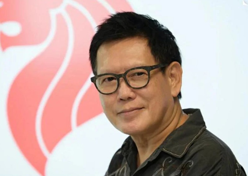
This man designed Singapore's iconic lion head crest in 1986


SINGAPORE - For weeks, sketches of a lion head crest plastered the desk and walls of senior advertising lead Michael Lee's office.
He drew hundreds of drafts by hand to get the design just right for his entry into a national search for a new symbol to represent Singapore.
Mr Lee eventually won the 1986 competition organised by the Ministry of Communications and Information, and his iconic design can now be found on everything from bank notes to flags, postage stamps and driving licences.
"While I was working on it, I ate with the lion and slept with the lion - everything I did I was thinking about the lion," he told The Straits Times in an interview.
The symbol - a bold red lion head drawn in minimalist style with clean lines - may soon be found on even more items after it was formally recognised as a national symbol by Parliament on Sept 13.
The lion head was recognised along with the national pledge, national flower Vanda Miss Joaquim and public seal, which will join the state flag, state crest and national anthem as Singapore's national symbols.
The new law will provide for more flexibility in how they can be used while raising penalties for abuse.
Mr Lee, who would only say that he is in his 60s, said he chose a lion head after considering palm trees and the city skyline because of its graphic power and longstanding relationship to Singapore.
Singapore, as the legend goes, was named by Srivijayan prince Sang Nila Utama after seeing a lion on its shores. Singapura means lion city in Sanskrit.
[[nid:539418]]
Mr Lee said: "A true symbol should be simple and uncluttered, but the simplest design is often the hardest to make."
To do this, he studied film and pictures of lions, understanding the angle of the head and deciding how to represent the king of beasts graphically.
He eventually divided the mane into five to represent Singapore's ideals - democracy, peace, progress, justice and equality - corresponding to the stars on the national flag.
His design beat out more than 260 others from other design houses and art schools, including at least 11 other lions.
As he does not own the copyright to the symbol, Mr Lee has not made a single cent from its constant use over the last 36 years.
Mr Lee, who is now freelancing as a creative director after a career in advertising in Hong Kong and Shanghai, said he feels a sense of great satisfaction seeing the symbol used across the island.
"I feel like I have made a tangible contribution to the nation," he said.
This article was first published in The Straits Times. Permission required for reproduction.