How a tailored layout made this tight 4-room HDB spacious

When Darryl and his wife first checked out their flat in Punggol, they realised that it lacked good natural lighting. This prompted them to trawl the web for design ideas that would "open up their space".
"Since it was in the default layout, the HDB was kind of dark, especially the living room," said Darryl. "We searched the web, gathering as much information as we could about the different styles and themes for home designs."
In the end, they decided that the airy Scandinavian interior would work best. However, the interiors saw a lot more updates. From the likes of basic paint work to the more complex layout tweaks, each change serves to elevate the space and give it a fresh look!
MORE ABOUT THEIR DESIGN NEEDS
Darryl (D): As a husband and wife duo, we didn't really need much storage space. I think the more pressing issue was the home's layout and how it affected the lighting. What drew us to the Scandinavian style was mostly because of its natural woody and bright aesthetic.
ON CHANGES MADE TO THEIR HOME
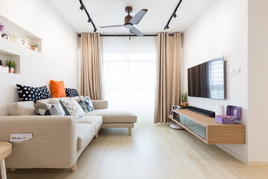
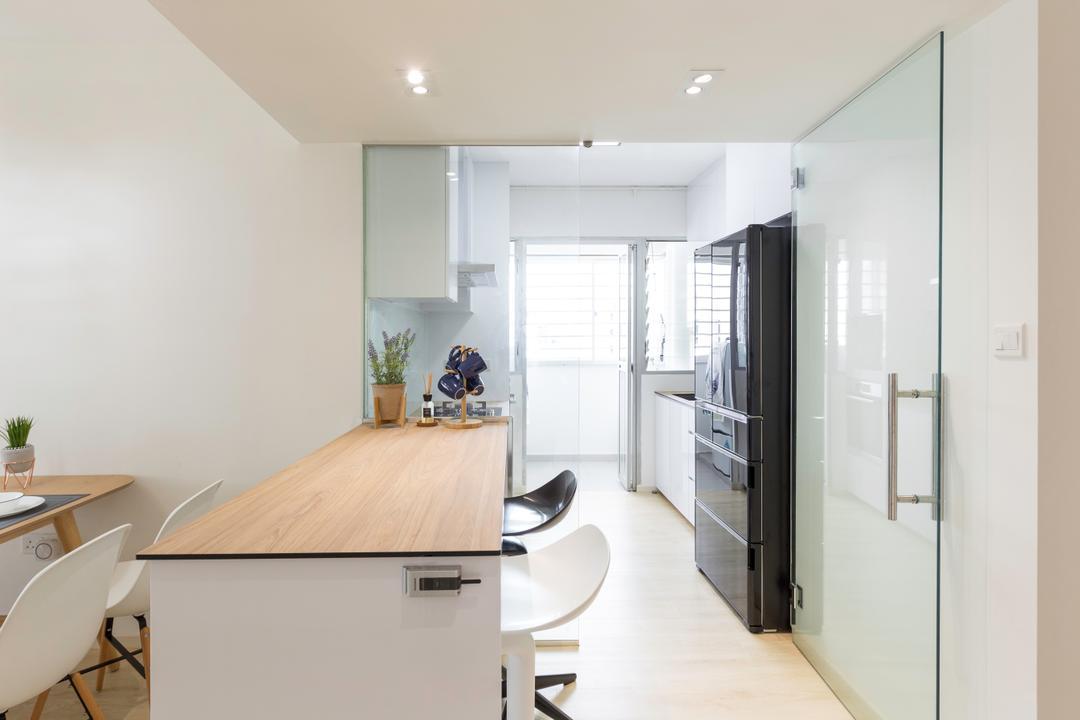
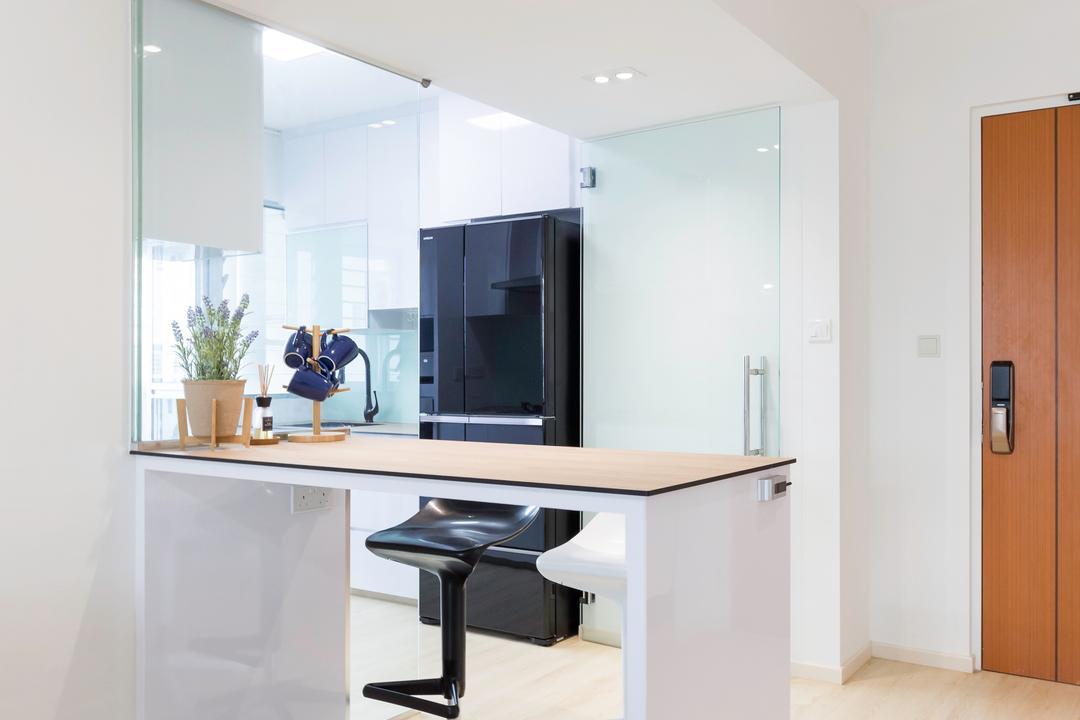
D: The communal spaces felt a bit tight on space so we hacked down part of the wall in the living room that connects to the kitchen and replaced it with a glass door. This really brightened up both areas. To offer us a little more storage space, a false wall with recesses was also built in behind our 3m long sofa.

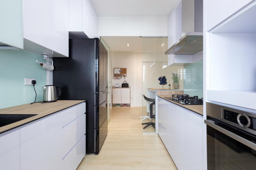
D: I'd say our kitchen got a few updates as well - KompacPlus countertops that matched with the overall theme and flooring choice (wood vinyl) plus a glass backsplash that further elongates the space. But our interior designer Frank didn't just focus on the style aspect, he also tried to make the space more functional for us.
He rigged up our cabinetry with fittings to improve the whole storage system - even our cabinets (they shut automatically after you push them to a certain angle)!
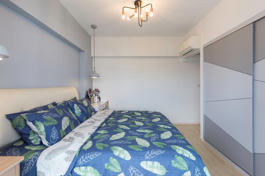
D: There are two centrepieces in the master bedroom although that wasn't the case in the home's original state. It was rather small actually. So we took out part of the wall and turned it into a wardrobe, which also features a rather visually arresting door that was designed by Frank.
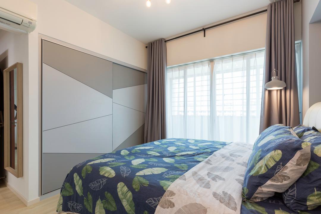
The second focal point is the recessed wall that we painted over! As the final touch, the space was finished off with a few stylish light fixtures.
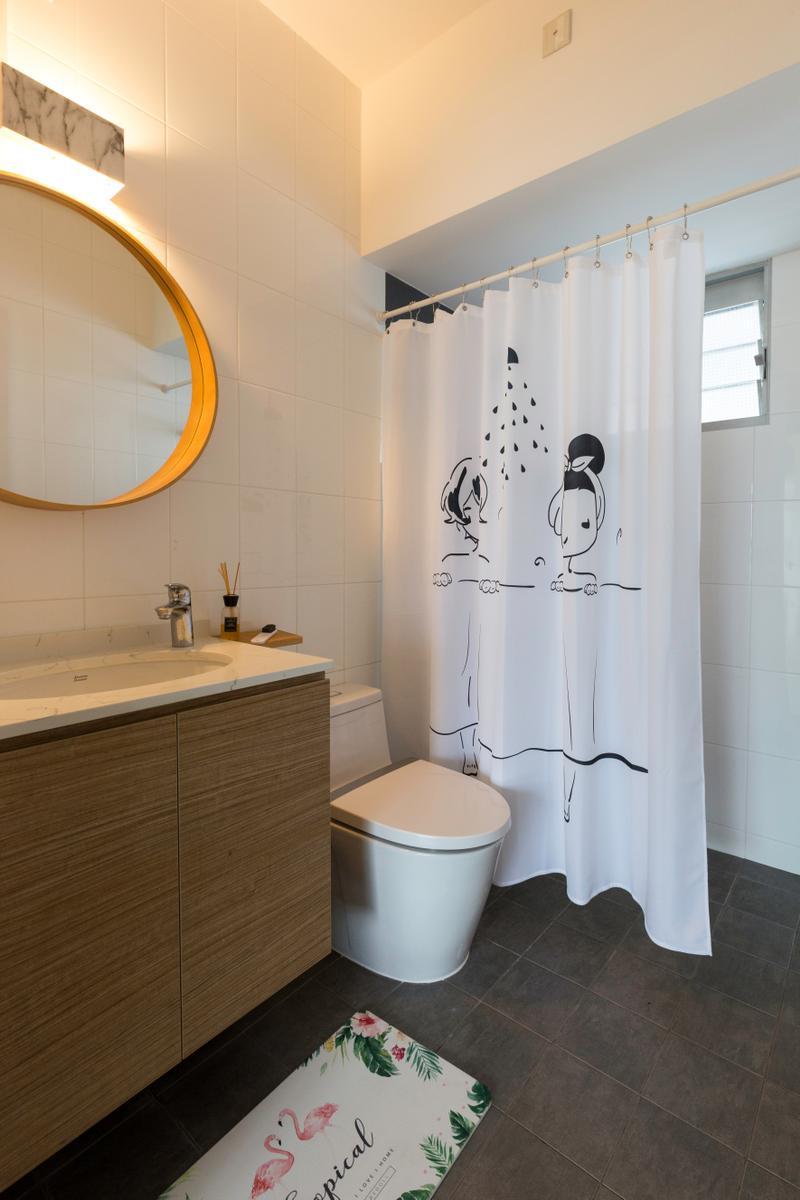
D: Though the bathroom saw the least work in the renovation process, we updated our vanity and bathroom fittings to get it to match better with the overall look and feel.
ABOUT GETTING TO KNOW DESIGN STORY
D: I read a Qanvast article and it said that I should get quotes from at least five interior designers, which was why I submitted a request through Qanvast. Frank from Design Story was very prompt, in fact he was the first to get back to me.
ON WORKING WITH FRANK
D: He was the reason we chose to work with Design Story ultimately. His work ethic was good. He's experienced, confident, doesn't beat around the bush and comes up with practical solutions based on our lifestyle, even going so far as to think about cost-effectiveness… say paint for instance. Other interior designers told us to go for the odourless option (which is slightly more expensive) while Frank told us that there's no point because by the time we move in the fumes would have already dissipated.

D: Every time the suppliers bring in a new design, he will update us and was extremely comfortable plus patient if we wanted a change. Thanks to him, our renovation journey was easy and smooth. The end result exceeded our expectations too - the home is loads brighter and he even finished the project before the predicted 2-month mark!
This article was first published in Qanvast.