

It's not just Kia: Why are carmarkers so desperate recently to announce new logos?

PHOTO: Kia
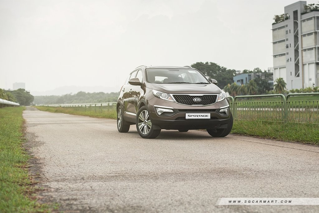
When the facelifted Kia Cerato was recently announced in Singapore, it didn't just feature a new grille and new head and tail lights - it was also the first over here to proudly wear Kia's redesigned logo.
Unleashed upon the world in a lavish ceremony during which even firework-launching pyrodrones were brought out to set a Guinness World Record, the new emblem was - is - a pronounced departure from the oval-encased, disparate red letters long associated with the Korean carmaker. Kia says that it "resembles a handwritten signature" with its single stroke which... Well, we'll talk about that later.
We need to clarify first that the new logo is honestly not very offensive. In fact, it looks, dare we say, quite cool, no matter where you come across it: On a screen, in the sky (the pyrotechnics, remember?), and even on sheet metal when we recently reviewed the Cerato.
Whereas the old logo was essentially a bland, glorified piece of text, the "handwritten signature" actually appears like its own symbol, especially from afar. Less imitable, and far more outstanding.
But then we decided to check out Kia's press release and... our eyes started swimming. This is what Kia had to say:
"The rhythmical, unbroken line of the logo conveys Kia's commitment to bringing moments of inspiration, while its symmetry demonstrates confidence. The rising gestures of the logo embody Kia's rising ambitions for the brand, and, more importantly, what it offers customers."
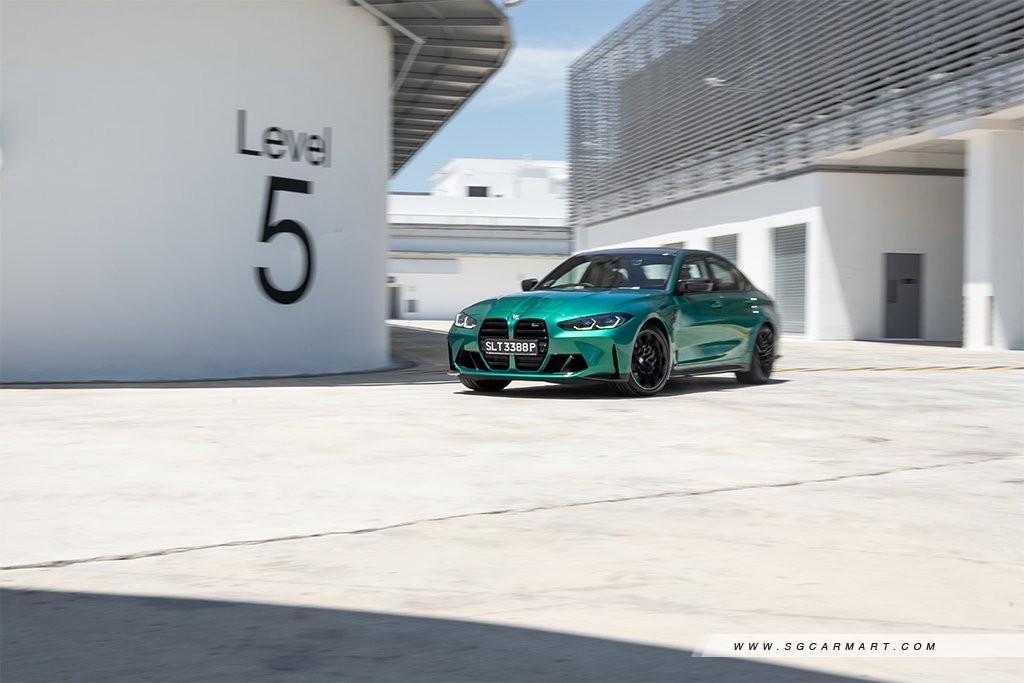
What? Unbroken lines and moments of inspiration? If, like us, you're suddenly feeling a lot more tired this morning/afternoon/evening after reading all that forced fluff, here's BMW's statement too when it updated its logo just last year:
"Pared-down and two-dimensional, [the logo] conveys openness and clarity. The additional transparent version of the logo is a more open invitation than ever for customers to join the world of BMW. The change reflects BMW's transition from centring purely on the automotive world to being about technology and connections."
Now, Kia's blabbering is forgivable under the account that its new logo actually presents quite a drastic departure from old. BMW's... not so much. Do they mean to say they weren't interested in technology, back when they unveiled the iDrive? Or that BMW wasn't transparent as a company in the past?
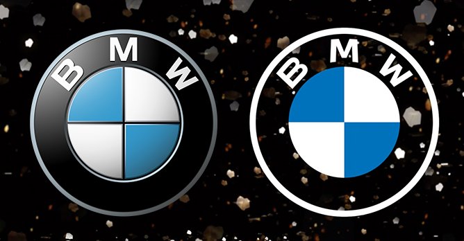
While we hasten to note that the Bavarian carmaker is only revising the logo for its brand communications (and not on its cars), its press release still feels like a whole load of unnecessary drum beating, especially because the new logo isn't so much revolution than mini evolution. Adding insult to injury is the fact that it hasn't been terribly well-received.
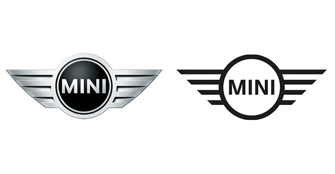
But BMW isn't alone in this - Toyota, Mini and Volkswagen are also among the players who've loudly sounded the trumpet only to reveal 2D-ified versions of their pre-existing logos. Why the heck are brands so eager to change? Why is the entire spectacle necessary?
Behind the extravagant and phrase-spinning marketing (my personal favourites include "moments of inspiration" and "openness and clarity", which sound more like what I used to pray for before my Q&A during Chinese oral exams than actual words in a well-funded press release), there is real value in a company's logo donning a fresh coat every now and then.
Branding experts note that logo updates are emblematic (*wink*) of a company's efforts to demonstrate that they are still relevant, and still alert to shifting trends and times. They can also work well to signal a pivot in brand image or direction, especially in moments of PR crisis.
The changes we've seen in the car industry are specific, but not unique. Across the board, the new logo changes in the car industry reflect a cognisance among its players that we are squarely in the digital era, and consequently, that properly communicating their brands in digital spaces is key.
Whereas the preceding trend had been inspired by a dated 3D pop-up effect, this new two-dimensional, flat one we're increasingly seeing allows versatility - to co-opt all that language - in communication across multiple platforms. It also means that cars no longer have to wear a chrome badge on their front and rear ends and can instead have their emblems backlit - an aesthetic befitting of the electric era.
Watching VW Chief Designer Klaus Bischoff passionately explain his design process, it's hard not to get swept up briefly as he asserts that the new logo will work just as well downsized, on a smartwatch, as when plastered riesengroß on VW's "sustainable factories". Digital or tactile, small or big - 2D is supposed to retain the detail better (apparently).
Furthermore, amidst the threats posed to personal car ownership by climate debates, carmakers are also taking logo refreshes as an opportunity to diversify their brand orientations. They're not just about making cars anymore - they also care about important stuff like mobility solutions, and, uh… extending open invitations to customers to join their world.

In the specific case of VW, we agree that the logo refreshing makes slightly more sense as an effort to continue shaking off its dirty image from the 2017 Dieselgate scandal.
The cleaner, lighter look of its new badge was announced alongside its intention to shift towards a cleaner, electric era as well. King SUV-maker Hummer, now recognising the viability of EV trucks, also announced its new logo with similar forward-looking declarations.
Admittedly, appropriate branding goes a long way. It allows companies to acknowledge that they've reached a certain standing, without actually having to say it. To that end, an increasingly minimalist look has indeed succeeded for some.
Google hasn't just monopolised the Internet, but arguably also the red-yellow-green-blue colour combination (in that order) - other brands don't just avoid it out of copyright fears, but probably because they'll wind up reminding people of Google instead of themselves.
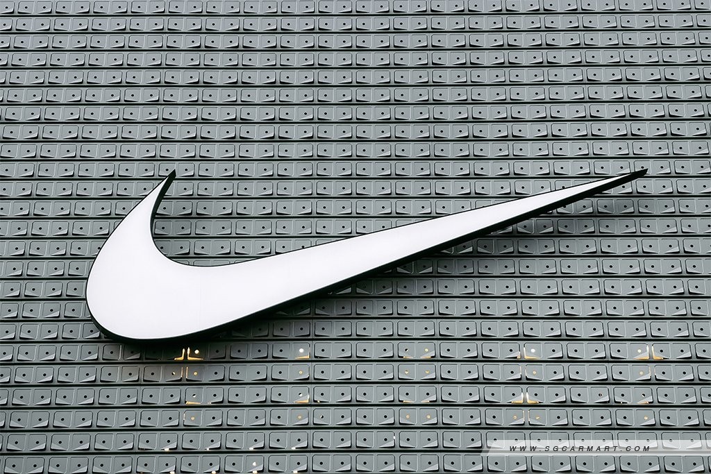
Many many years back, Nike also dropped its name from its logo as one of the most prominent "You already know who I am" power moves known to the world. Toyota's recent update (for its Europe division) follows this exactly.
But Kia isn't quite on that level yet. In contrast to names like Volkswagen, or Bee Em Double-Yoo, Kia hasn't stopped wiping away blood, sweat and tears while putting in the work to earn its stripes.
Picture the Korean carmaker as a snarling tiger on the prowl for more prey - still as ferocious now as it suddenly became 10 years ago, when German designer Peter Schreyer joined as Chief Designer. A badge redesign accentuates this call to be taken more seriously. "I'm hungry", Kia roars, tiger nose and all.
Toyota and Volkswagen - even BMW - are more like calm, well-fed lions; majestic alphas stretching out in the shade, the taste of success no longer unfamiliar in their mouths. Their prey come to them. They don't need to overhaul their logos anymore. A light tweak every now and then may be sensible; a drastic revision, counter-intuitive, and potentially disastrous.
What is annoying about the updates from Toyota, BMW and MINI is the fact that they seem to recognise this - yes, the new logos are not all that different, and they don't have to be - but have chosen to make a verbal masquerade out of it all anyway.
Toyota even enlisted a consultancy firm to help with what was essentially a simple flattening out of the logo, dropping of its name and, of course, a hyped-up explanation of what this all meant - a situation that brings to mind fawning over the Emperor's new clothes.
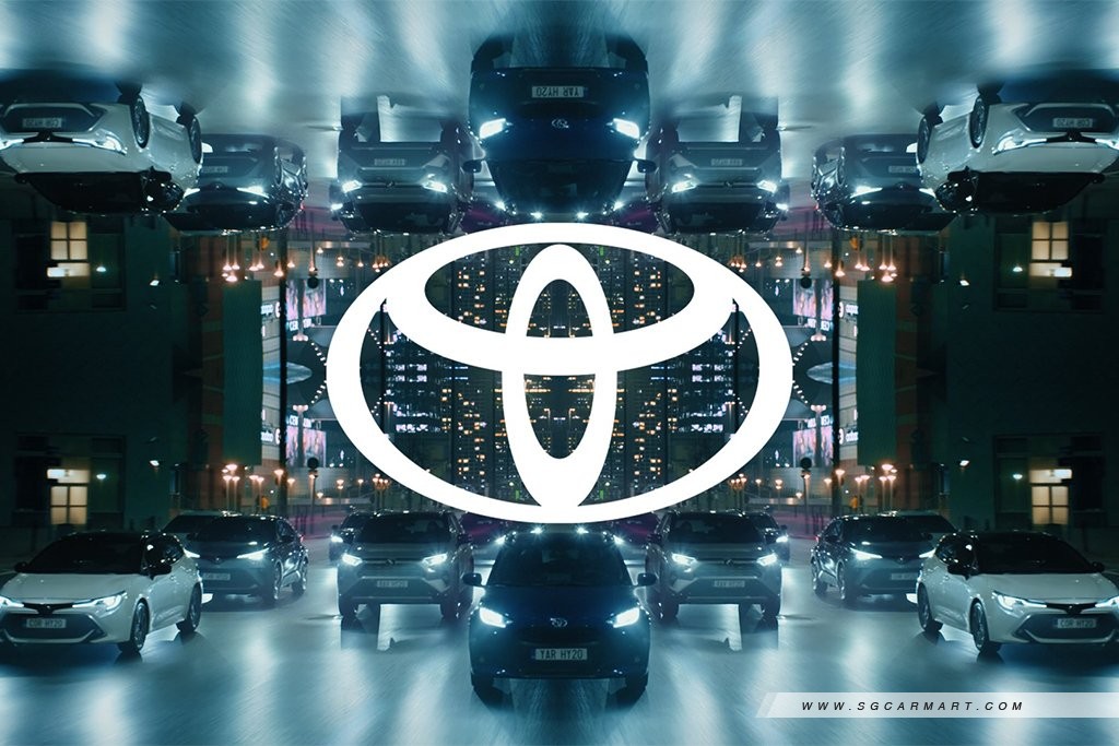
Take a leaf out of Tesla's playbook: A bigger power move would have been for Toyota to tweet its new logo sans name without explaining why at first, then get the intern running the Twitter account to reply only when someone asked. Huh? Oh yeah, it's because we're already that big. Didn't you know?
Still, we admit that all of that chatter around the meaning of logo changing is very harmless, if superfluous, corporate chicanery.
What matters above all is that our carmakers leaders in mobility solutions continue pushing the boundaries with their cars. We want the best emission-reducing tech and ever-reliable Altises from Toyota, the same way we continue to demand Freude am Fahren from BMW. For VW… err, just don't repeat Dieselgate (which is really not that tall an order anyway from a regulatory standpoint, since diesels have already received their death sentence).
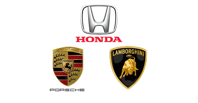
A refreshing counterpoint to all the charades we've seen is Honda. So self-assured is the Japanese giant that it hasn't bothered disturbing its logo since the year 2000. (You'll notice when you visit Honda's Singapore website that Kah Motors has silently and casually adapted it to 2D anyway to make it look more seamless.)
21 years - that's longer than some of Honda's luckier customers have been alive, possibly. The Civic? Still wiping the floor with its competition in the C-segment.
Look also to ultra-luxury/performance names, like Porsche and Lamborghini, to find those who haven't bothered too much with their logos (yet) but are still churning out great 21st century machines.
Perhaps then, this is the best way to demonstrate you're still serious about the game: Let your cars (and your investments in fresh ideas and technologies) do the talking. To be fair to everyone, we've at least seen the auto industry doing this increasingly and collectively. Okay guys - we'll let all that fancy marketing slide this time.
This article was first published in sgCarMart.