

9 super stylish HDB designs that look and feel like condo
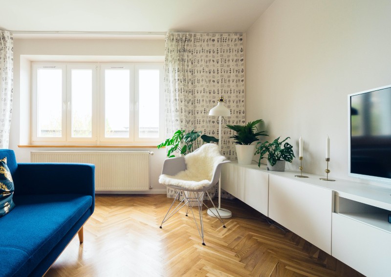
PHOTO: Unsplash
While there is no universal standard, we definitely have a certain idea how a condo should look like. Stylish and modern. A touch of class and luxury maybe.
Comfortable, definitely. For us folks living in an HDB flat, channeling that condo vibe isn’t difficult or impossible.
Sure, there are lots of standard fixtures in an HDB flat that you can’t get rid of. But with the right colour scheme, the right material play and proper layout planning, you might just get a flat that looks and feels like private property.
Want to know how? Bookmark these homes that went above and beyond what an ordinary HDB flat can do.
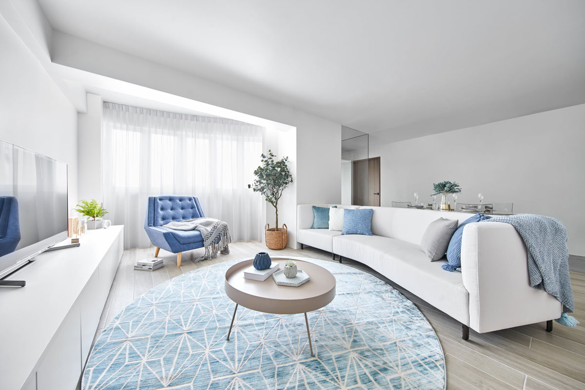
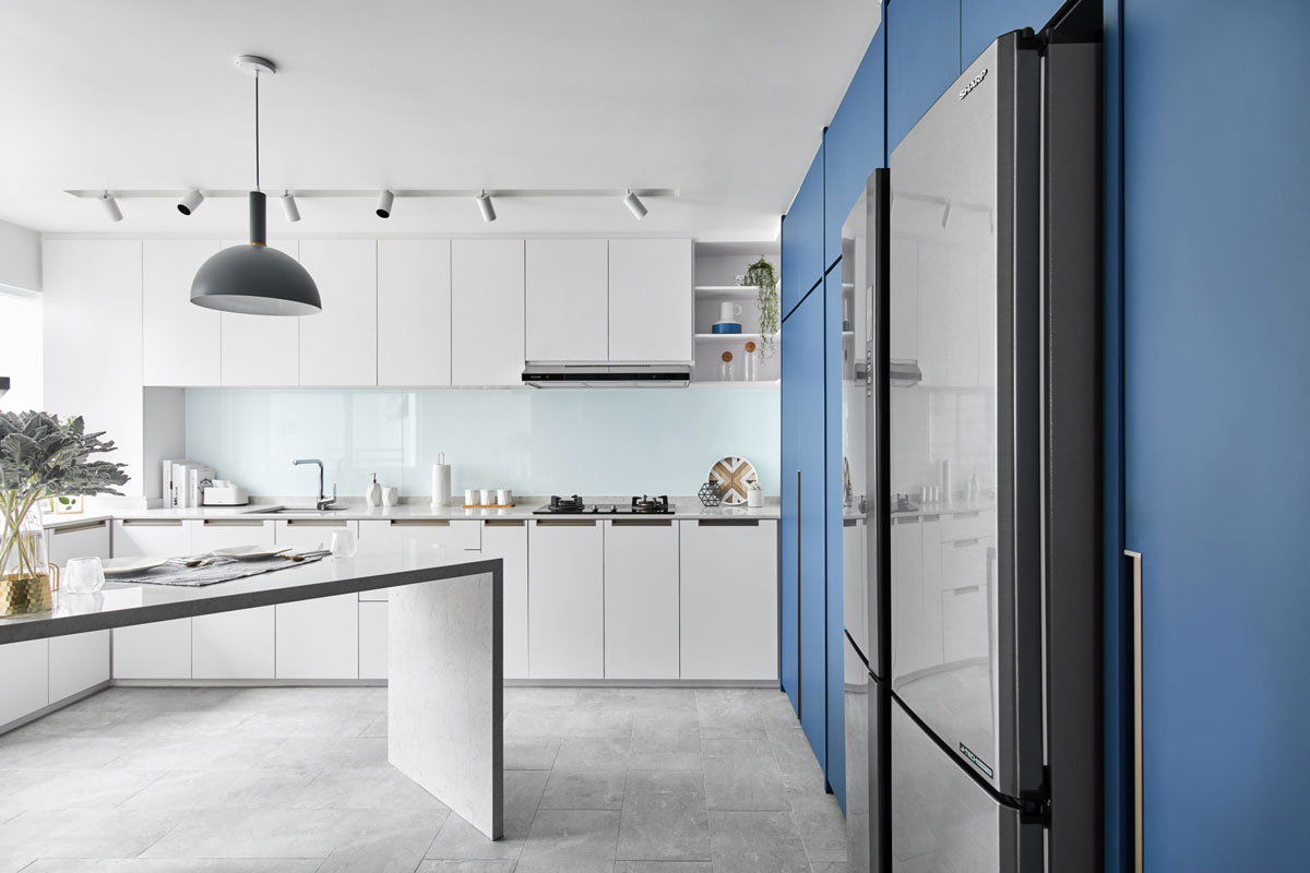
Using a consistent colour palette of white, grey and blue throughout this resale flat helps to conceal the awkward corners existing in the layout. These include the curved balcony area in the living room and the odd-shaped kitchen.
For the balcony, an original divider was removed so that the entire living room could feel more spacious. A custom curved sofa and an oval-shaped rug blend in with the unique layout. In the kitchen, custom cabinetry maximises the amount of storage space in the cooking zone.
An island was fitted to be perpendicular with one of the angled kitchen walls.
Woodgrain surfaces give warmth and add texture to the home, without being too obtrusive. This is most evident in the home office, which features carpentry covered in woodgrain laminates.
Concealed behind glass walls for physical but not visual privacy, the study area doesn’t feel divorced from the rest of the home’s design.
See the rest of the home here
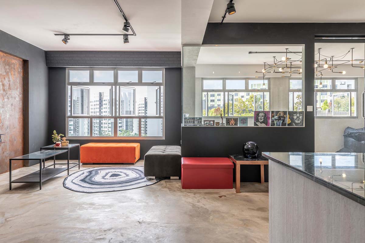
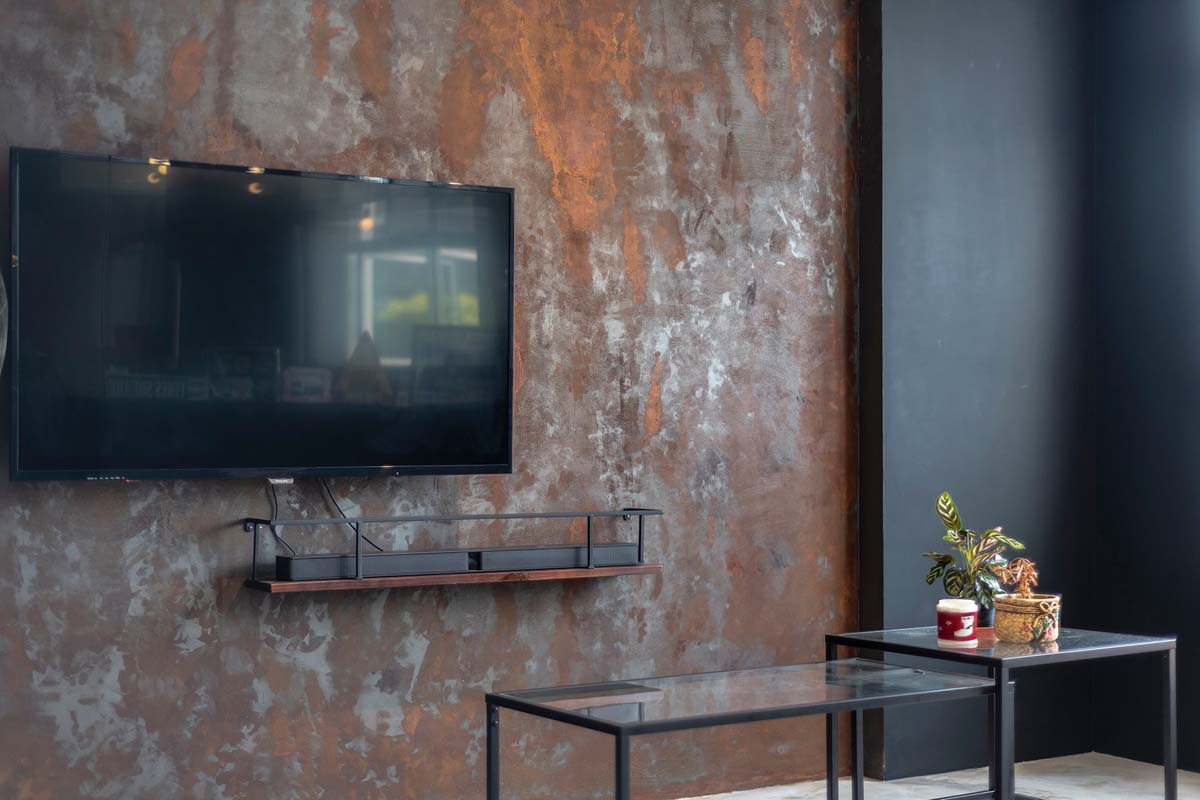
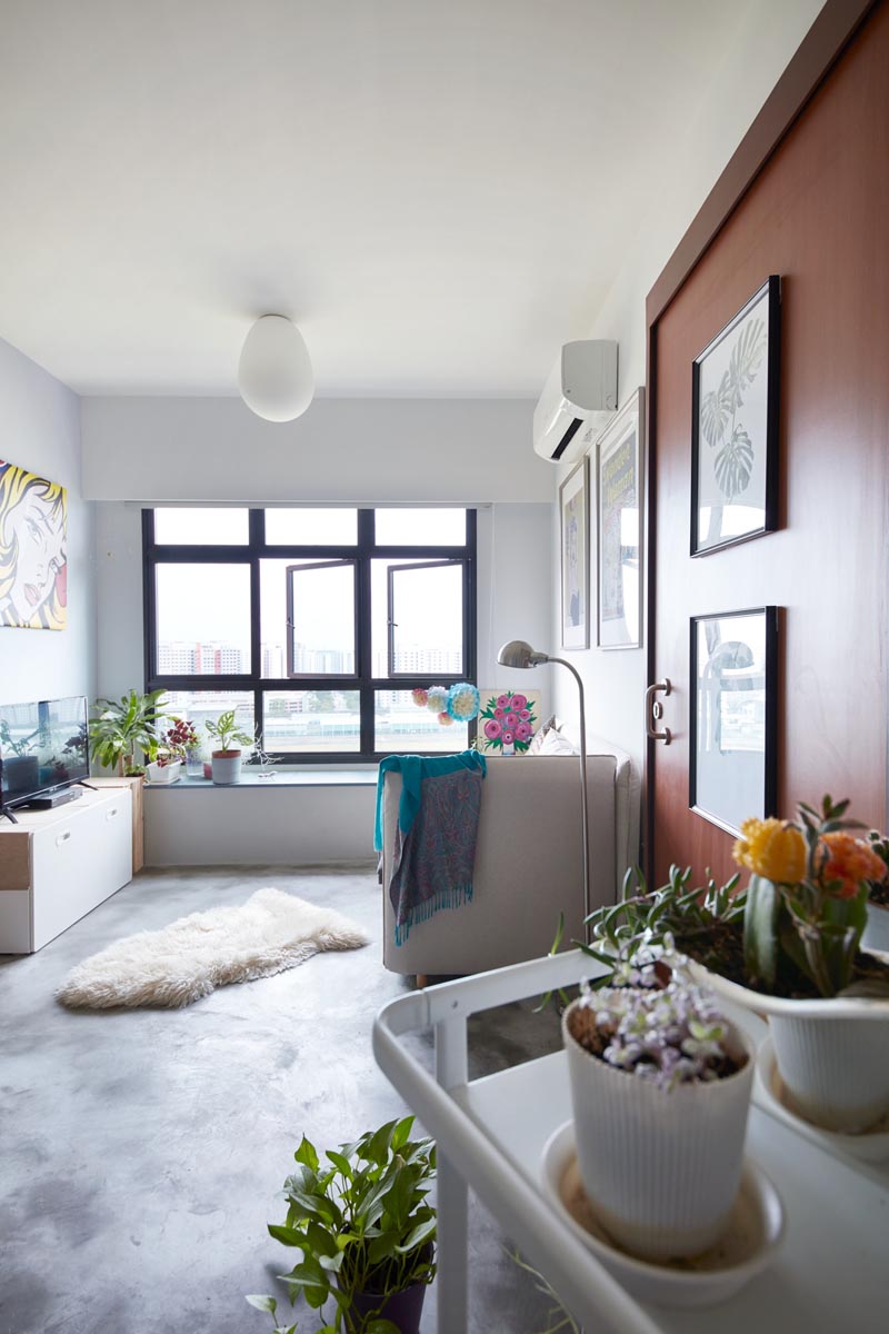
This 4-room BTO takes its design cue from the industrial style lofts in New York. You see it through its open plan, cement screed flooring as well as the rustic, textured walls.
An eye-catching rust-effect feature wall in the living room is also a nod to the inspiration.
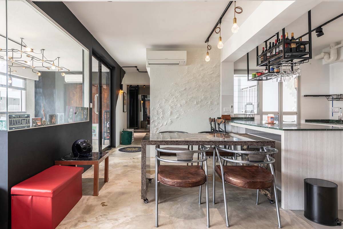
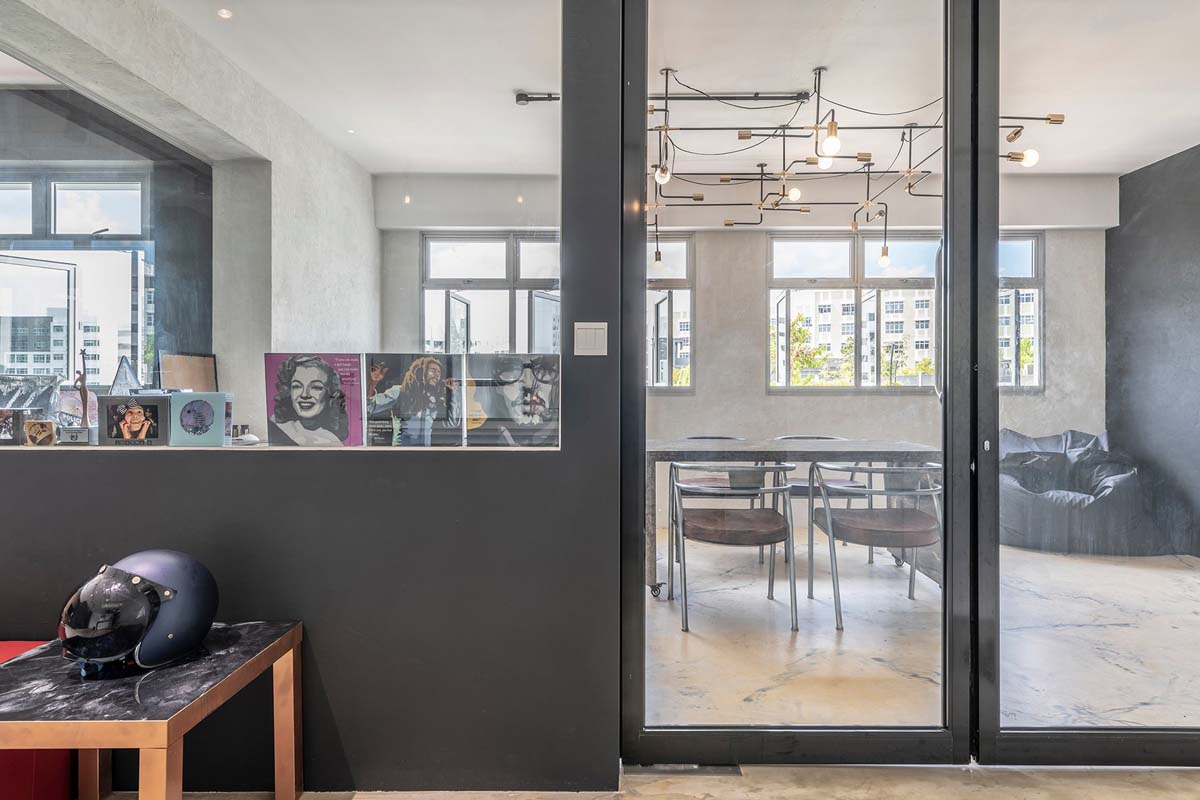
As the homeowners were frequent hosts, the designer combined two of the spare bedrooms into one all-purpose space, which they used to entertain their guests.
Surrounded by glass walls, the area features a moveable dining table for greater flexibility and a gorgeous industrial-style ceiling lamp that spans the size of the two rooms.
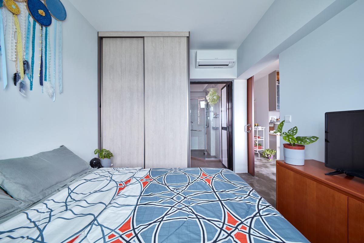
The entrance into their master bedroom was removed so as to create a larger sense of space. It leads first into a dreamy walk-in wardrobe area, where wardrobe fronts clad in mirror panels lend function while creating a bigger illusion of space.
The sleeping zone is sequestered away behind mirrored sliding doors for extra privacy.
See the rest of the home here
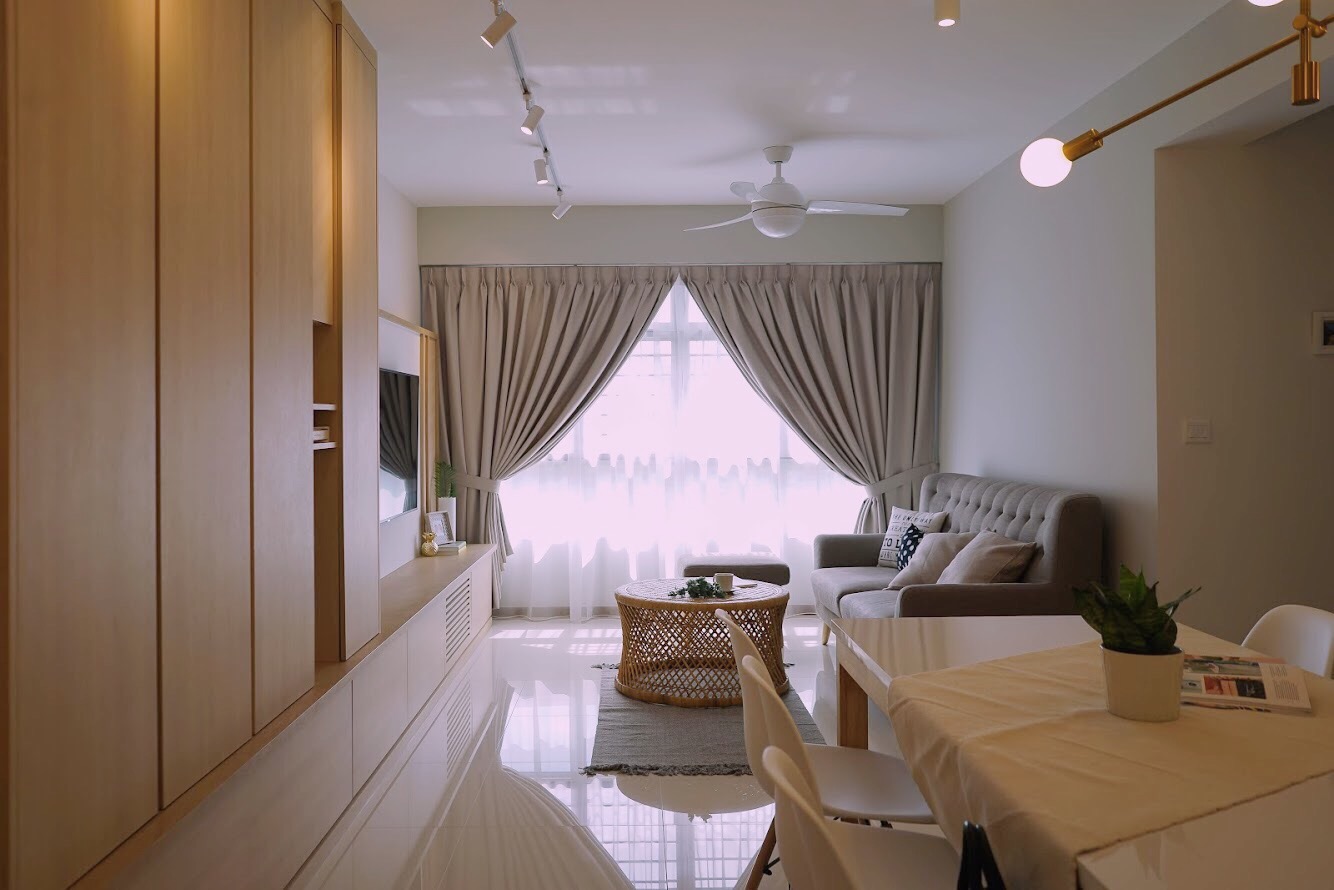
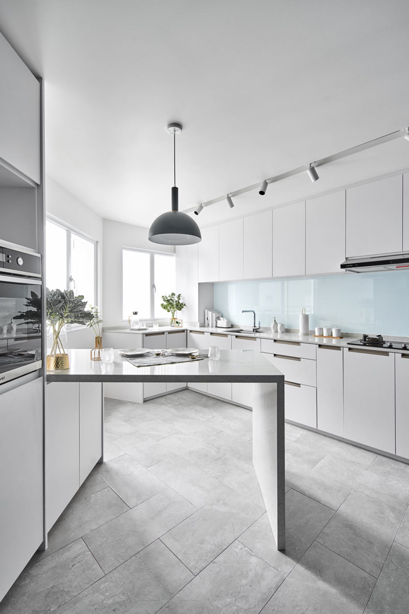
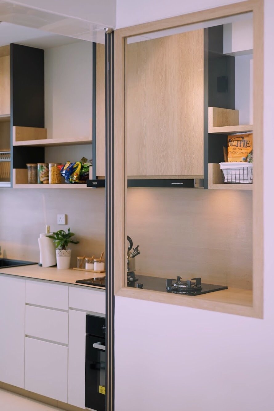
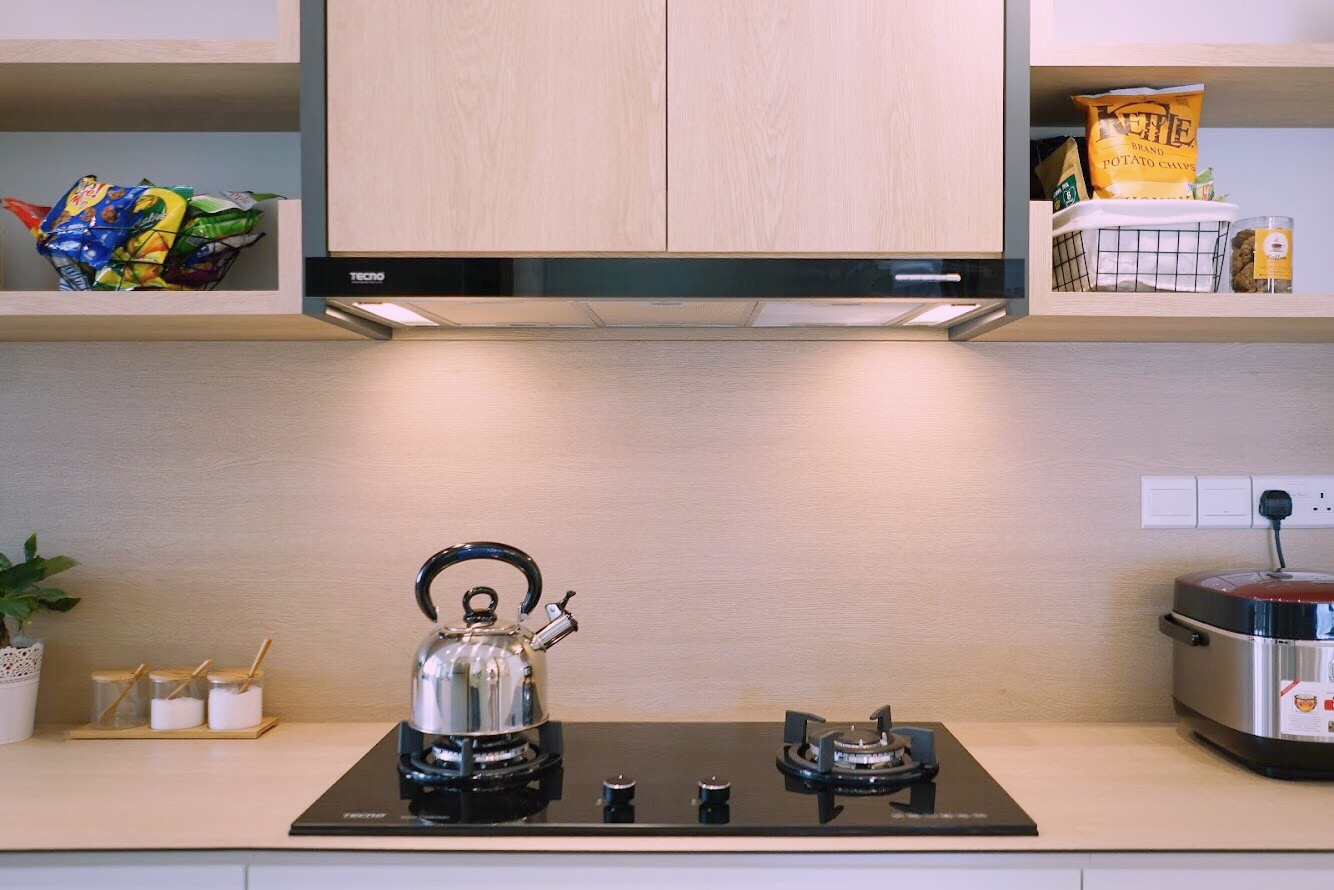
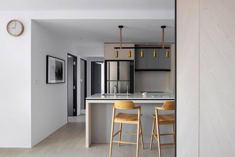
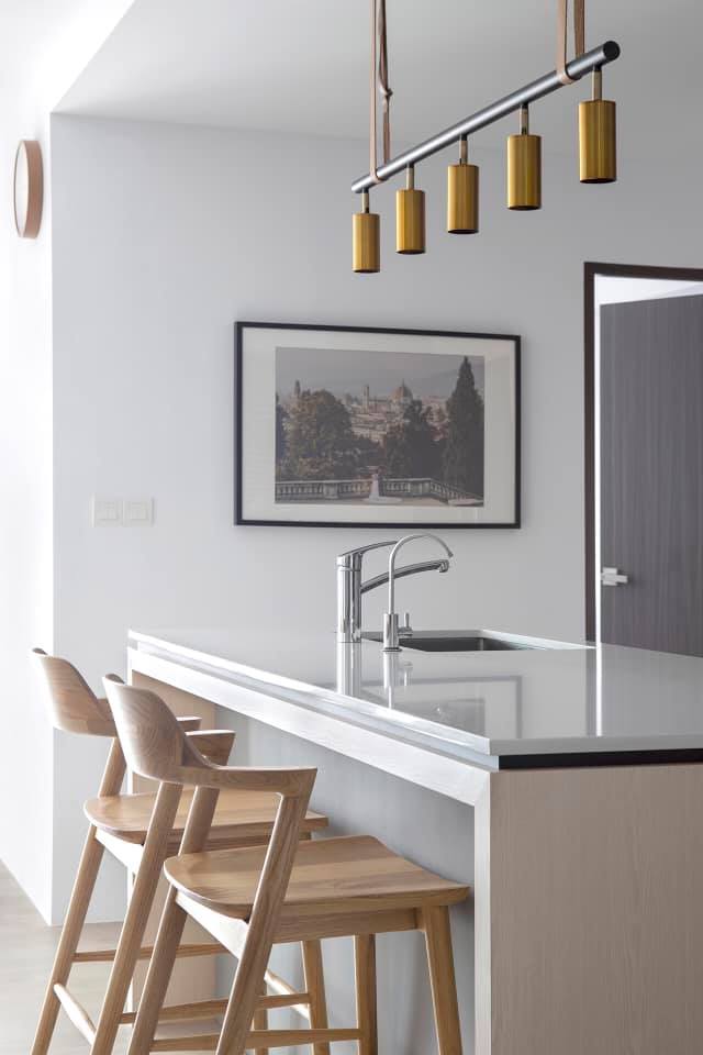
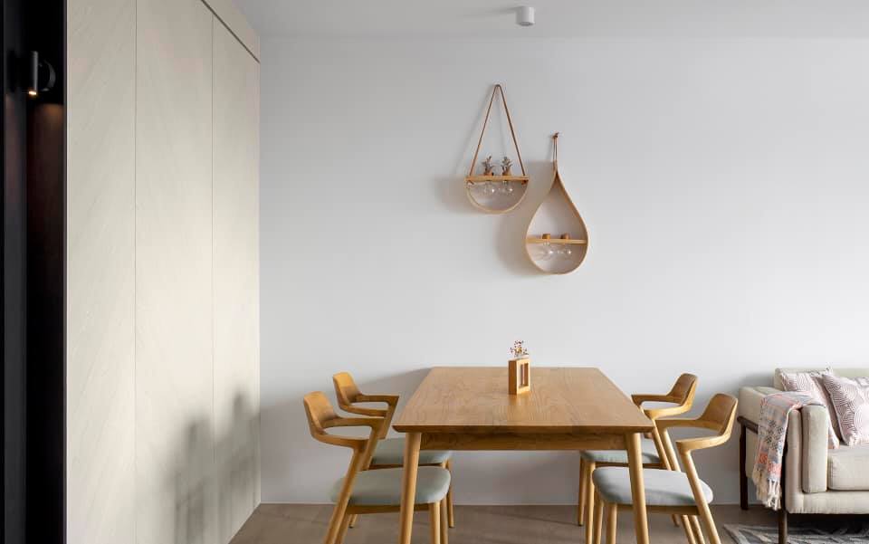
White and light wood tones are the main material and colour play in this condo-like HDB flat. It’s a basic yet classic scheme, and the milieu immediately translates into a light and airy one with a touch of chic.
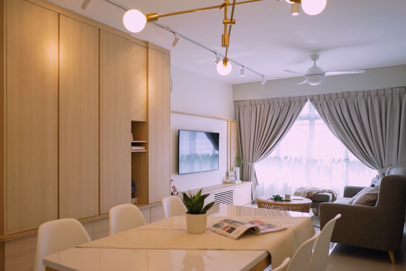
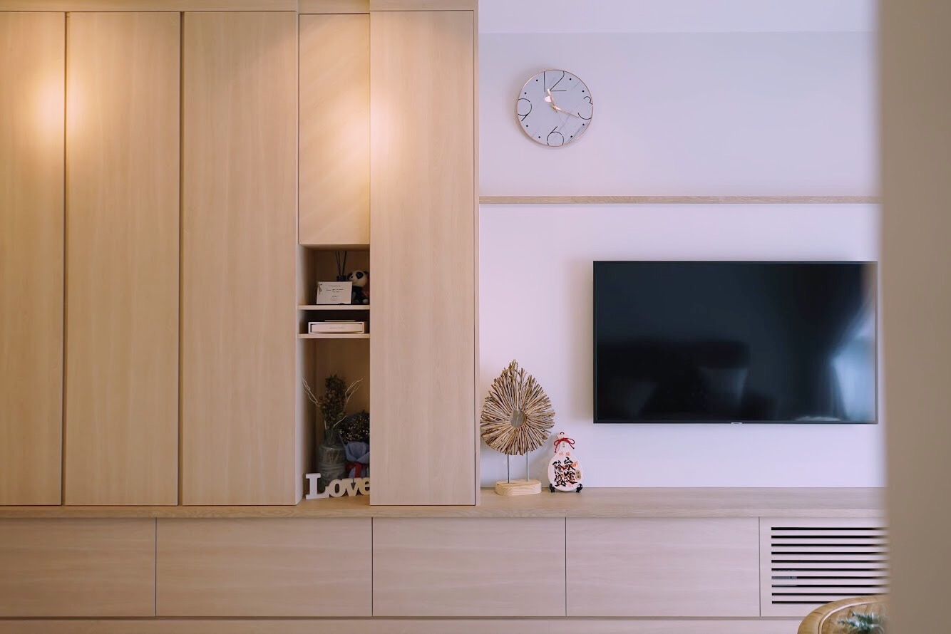
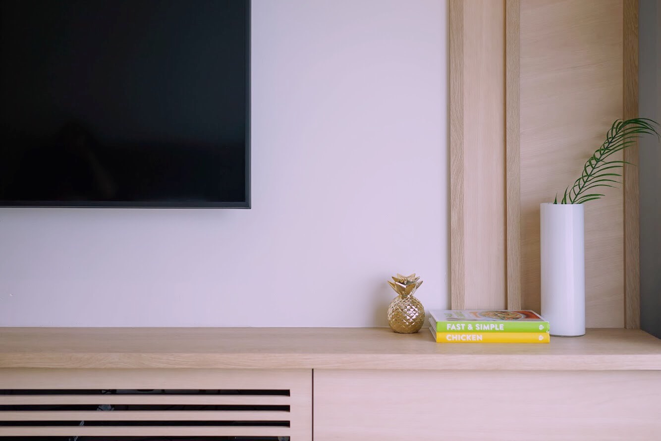
Built-ins in this apartment provide plenty of storage solutions. The communal space sees a full-height cabinetry that extends all the way from the foyer into the living room to serve also as a TV console.
The one-piece structure lends more visual continuity, preventing the space from appearing too disjointed.
The kitchen is stowed away behind a glass door and window, which offers a peek into the kitchen design. Decked out in similar white and wood tones, it definitely stays in tune with the rest of the home.
See the rest of the home here
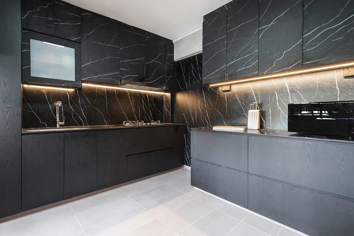
Much of this executive maisonette is covered in dark and grey-hued wood-lookalike laminates, which lend a moody ambience without feeling too cold.
Crisp white walls offer a visual contrast, keeping the entire home feeling clean, spacious and open.
Clad almost entire in woodgrain laminates, the open-concept kitchen is one of the flat’s design highlights.
It features a generous-sized island as well as concealed cabinets that not only provide plenty of storage but also conceals a mini pantry area.
![]()
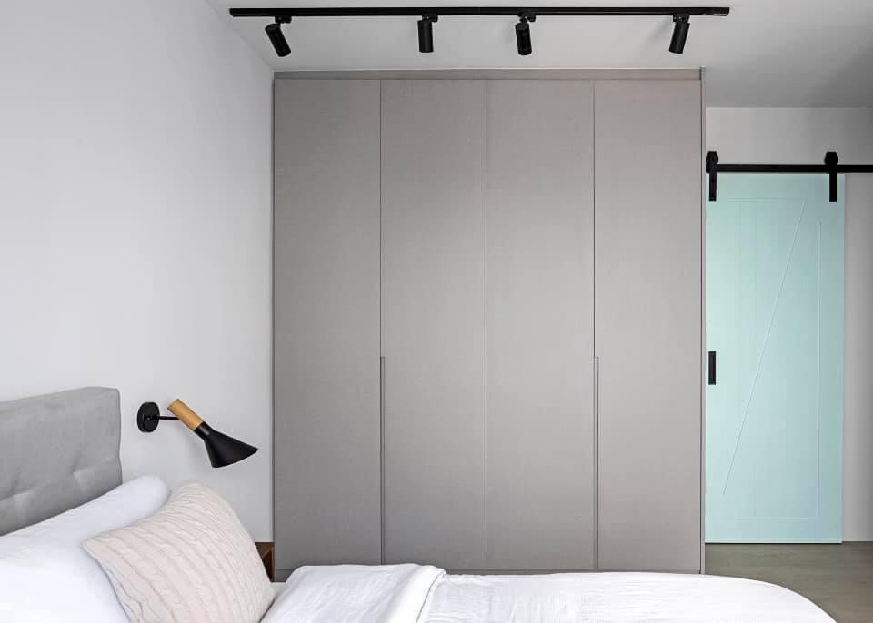
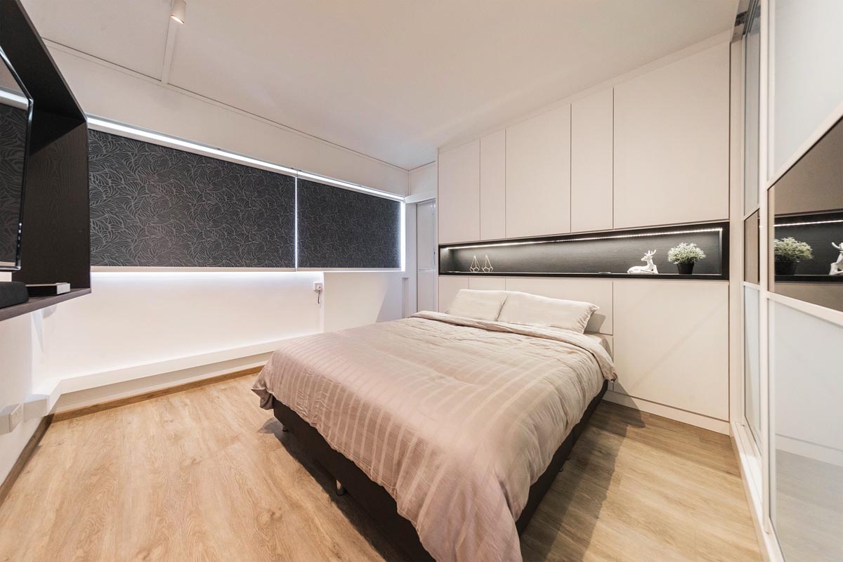
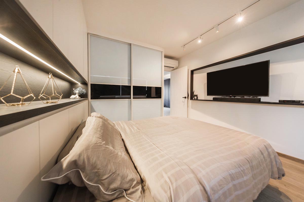
In the living room, a lighter palette helps to create a visual demarcation from the kitchen. Upstairs, the bedrooms feature a more sombre scheme with dark laminates, providing the visual cue that these zones are for resting and relaxing.
The new master bedroom was fashioned from two bedrooms, and now features a walk-in wardrobe, a workstation and an open bathroom that comes with a shower area and bathtub.
See the rest of the home here
This home feels oh-so-calming, thanks to the uncomplicated, minimalist lines and the gentle colour scheme featuring neutrals.
You see it in the kitchen, which is purposely kept small as the homeowners aren’t frequent cooks. A sizeable kitchen island serves as prep area while also doubling as a hang-out zone. Wood, leather and metallic textures add visual interest in this cooking zone.
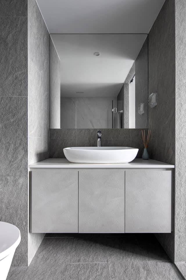
The soothing scheme is also seen in the rest of the apartment. The dining area is defined by a wooden dining set while the bedroom features a light grey wardrobe. In the bathroom, walls were clad in stone-textured tiles for added visual dimension.
See the rest of the home here
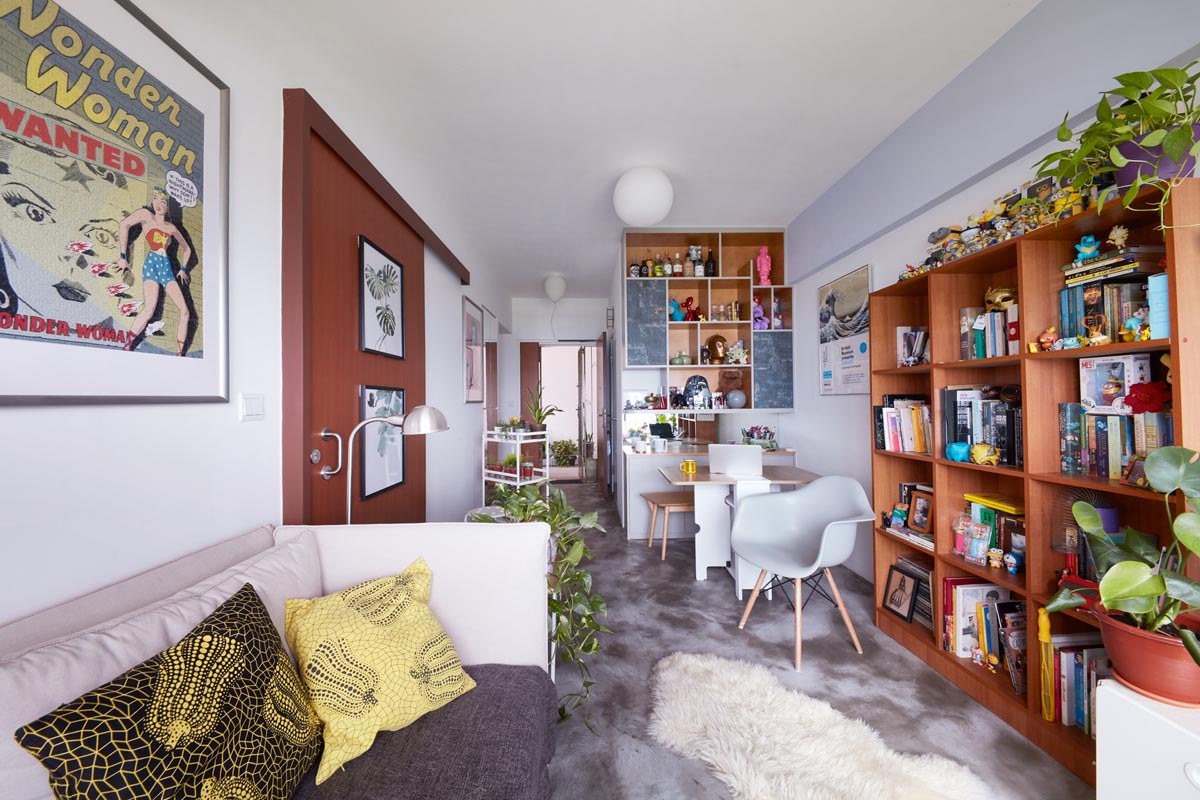
Covered in cement screed flooring and white walls, this home is the perfect canvas for the homeowner’s many art pieces and collectibles.
They pop against the neutral backdrop, lending plenty of character and personality to the small space. Greenery adds a refreshing touch, contrasting against the concrete beautifully and enlivening the spaces.
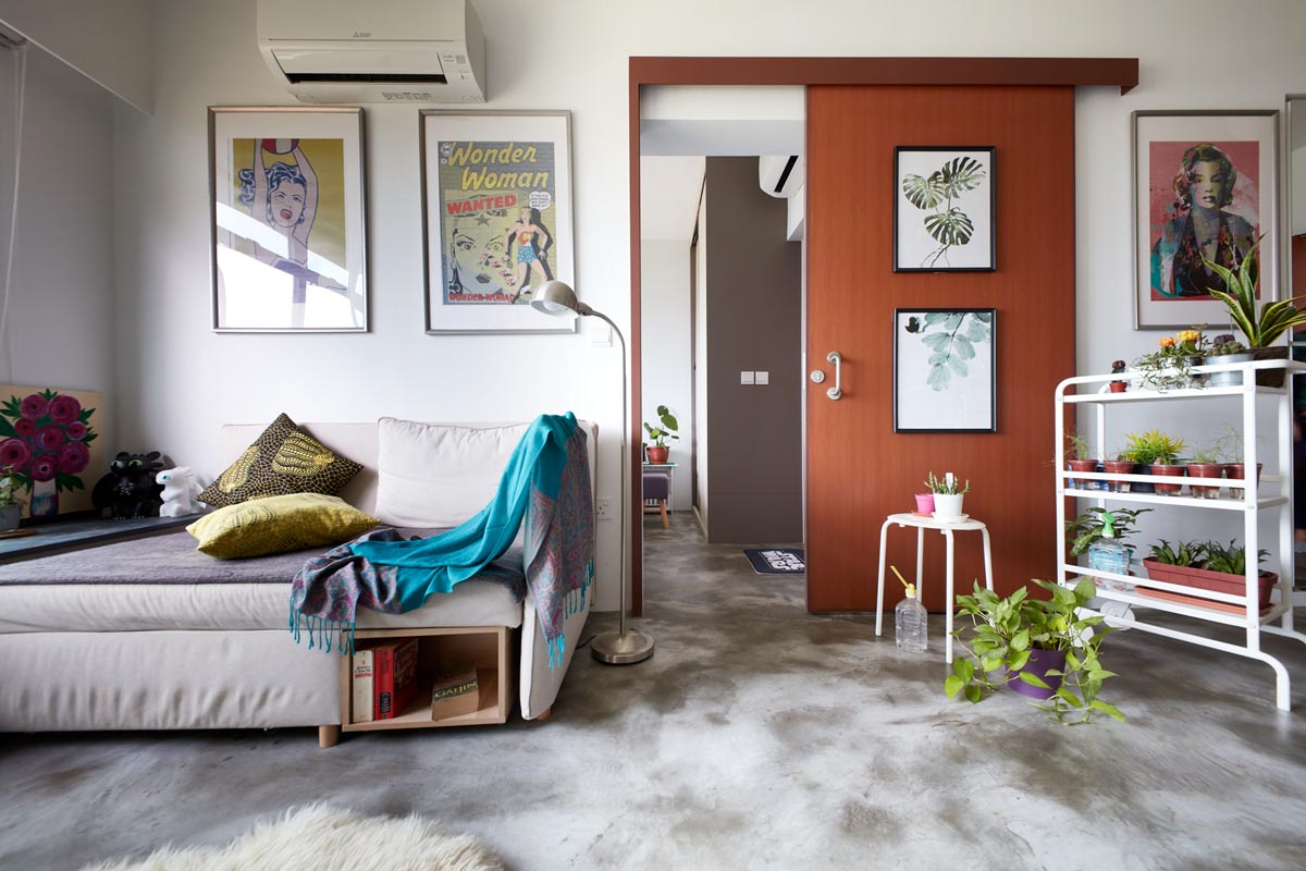
Wood shelves were customised to provide room for display and storage.
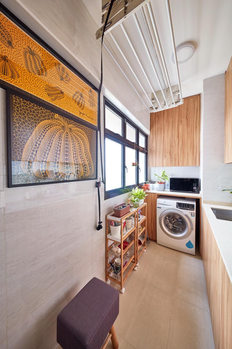
Each surface area wasn’t spared from decor, with prints and posters lining even the sliding door to the private spaces of the flat. The kitchen, which shares the space with the service yard, also features framed art.
See the rest of the home here
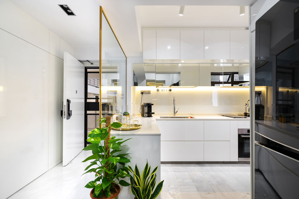
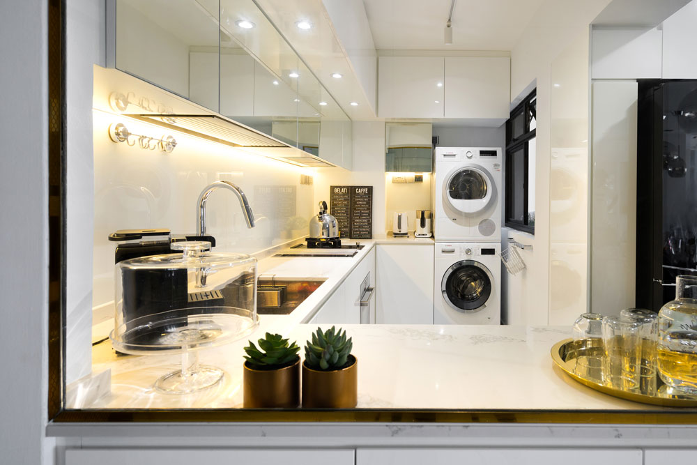
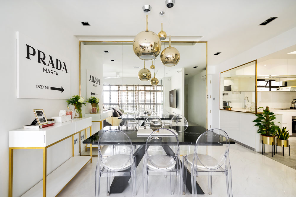
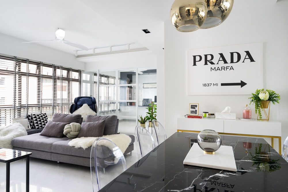
Polished surfaces, glossy cabinets and metallic accents make for a home that feels extremely indulgent and luxurious. An all-white palette pares things back and keep things modern without making the overall look tacky.
In the kitchen, a brass-framed glass divider separates the foyer from the cooking zone, while still allowing plenty of light into the space.
The addition of a few mirrored cabinets brighten the all-white space further, while adding an air of opulence. It draws symmetry with the statement mirror feature in the dining area, which opens up the rest of the home considerably.
The living room feels spacious, made to feel even larger as the walls to the spare bedroom were hacked away. The extra area serves as an entertaining area while also doubling as the home office.
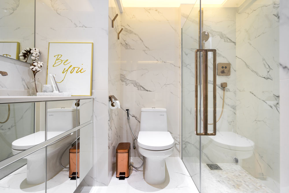
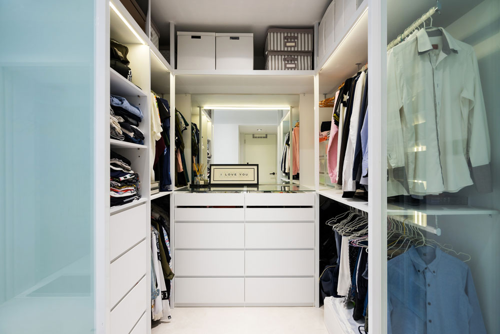
Mirrored cabinets were seen again in the bathroom, which is decked out in marble print tiles in line with the luxury theme, while the bedroom is just as decadent with its open-plan walk-in wardrobe.

See the rest of the home here
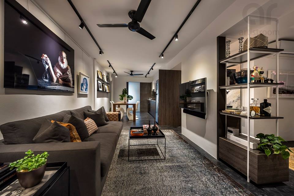
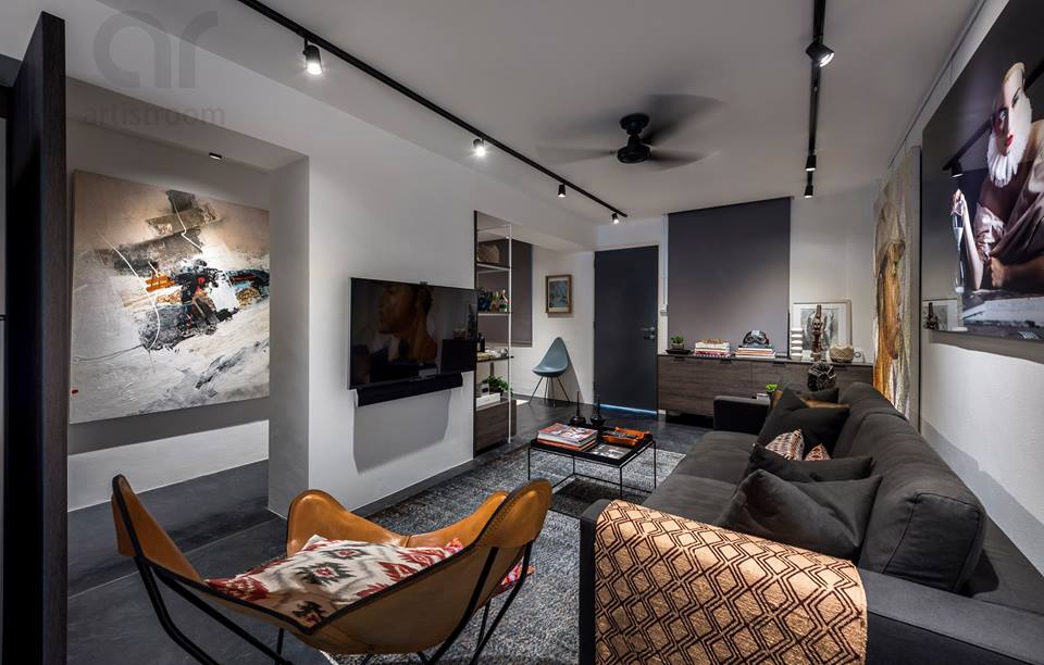
With a long linear layout, a masculine palette of white, grey and dark browns, and walls covered in art, this apartment feels just like a gallery or museum.
Strategically placed track lights also help to illuminate the different art pieces, furthering the gallery-like ambience.
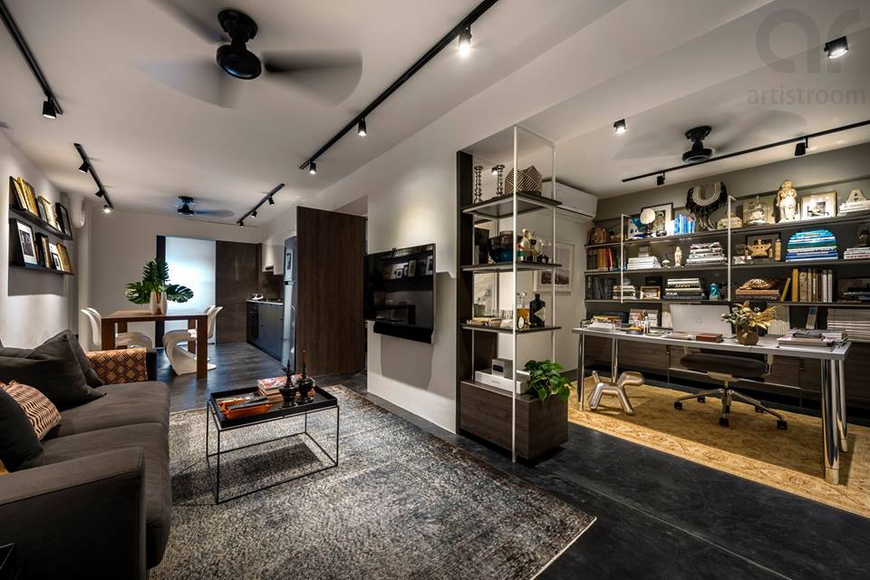
The designer opted for an open plan by hacking away walls in order to maximise space and to prevent the small home from feeling too cramped in.
Instead, clever dividers were used to demarcate the different areas of the home. For instance, the living room is separated from the home office using different flooring and a see-through shelf, while a woodgrain panel is used to mark out where the kitchen ends.
See the rest of the home here
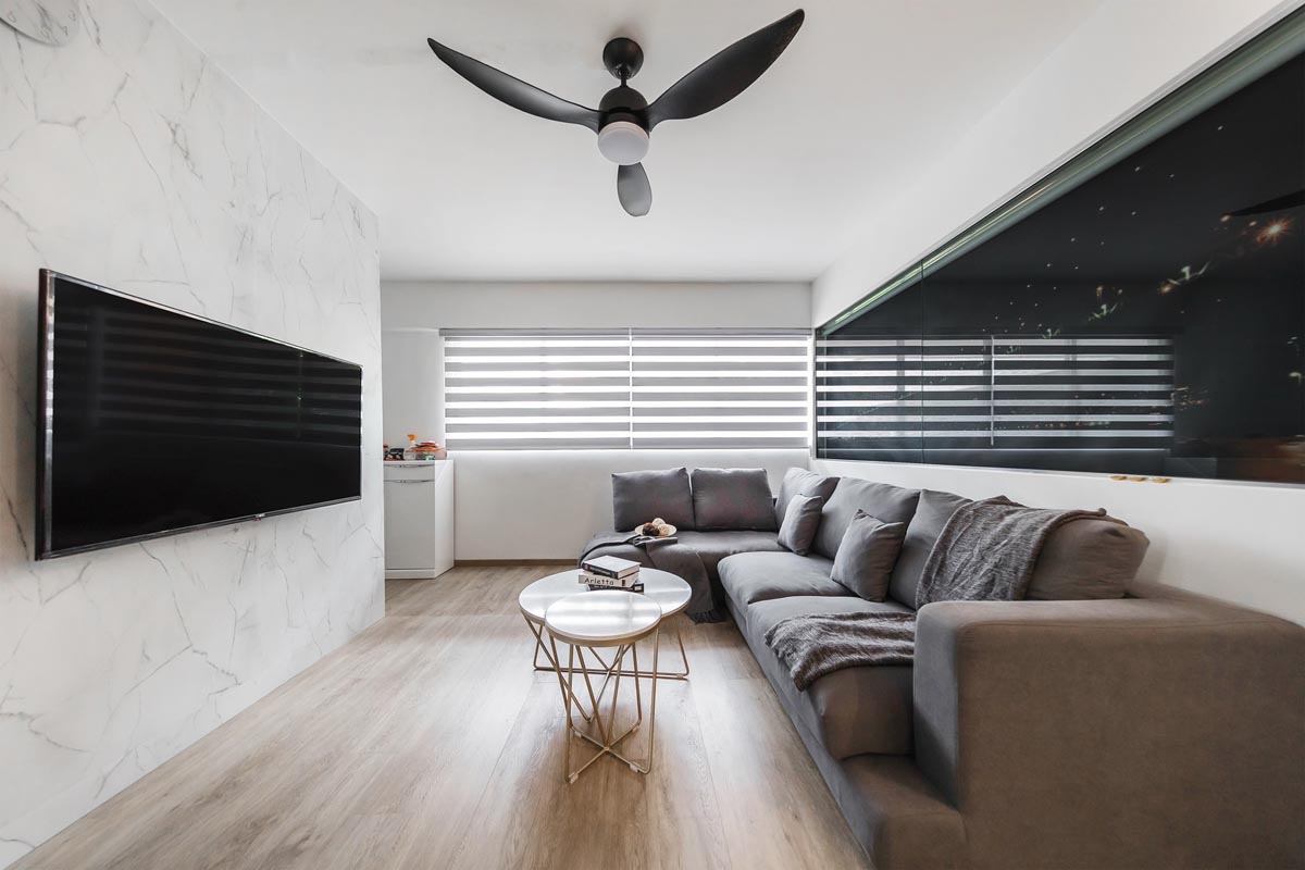
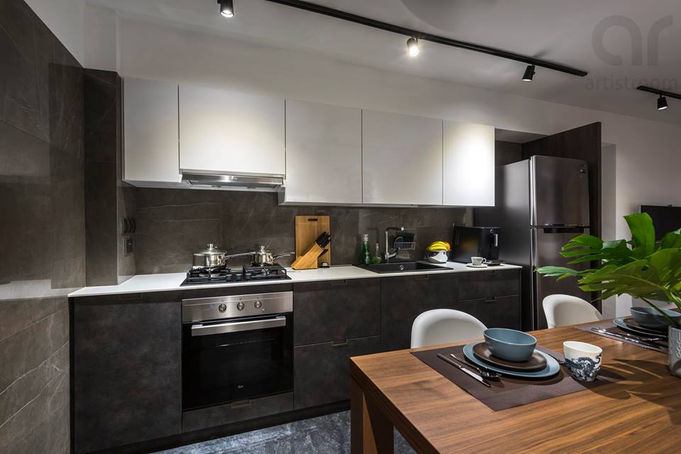
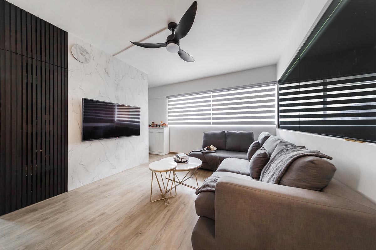
This contemporary style flat keeps to a simple colour scheme of neutrals, creating a timeless appeal to the space. Much of the design features were also kept sleek and simple, with subtle textures adding visual interest.
The living room’s TV wall for instance is covered in a laminate with an understated marble print. It adds detail, without taking away too much attention.
The same marble detailing is seen in the kitchen, which is kept to a predominantly dark palette to serve as a contrast to the rest of the home.
The marbling is kept to the top cabinets and backsplash, while the bottom cabinets are clad in discreet woodgrain laminates.
In the bedroom, storage is maximised through full-height cabinets behind the bed. A recessed TV wall also provides a ledge for displaying a sound bar and other media units.
See the rest of the home here